Forum Thread
New Canvas (Ctrl+N)
Forum-Index → Fan Clubs → Inactive Clubs → New Canvas (Ctrl+N)Preferred nickname (optional): Bui or Dou
Art gallery (dA, art dump, etc): My Deviant Art
Password: Duck
Preferred nickname (optional): D, Dcas
Art gallery (dA, art dump, etc): my deviantart
Password: Dog...e
;;
Preferred nickname (optional): Ray
Art gallery (dA, art dump, etc): My DA
Password: Rat

[FlightRising] ☆ [Adopts] ☆ [Doodles] ☆ [Characters]
Preferred nickname (optional): Suvi, Nappy, Dopp, or Seaweed
Art gallery (dA, art dump, etc): Journal Art Dump
Password: but ive got a blank space bby
Investigating the odd and novel is key to
any good merchant's success!
halberd, he/it/they or none,
adultPreferred nickname (optional): Pilufa doesn't have nicknames D :
Art gallery (dA, art dump, etc): Gonna move this to dA soon
Password:

Preferred nickname (optional): Mocha
Art gallery (dA, art dump, etc): DA
Password: Muskrat

I followed a tutorial on youtube and I think it looks ok.
I also tried to add shadows, but that's the part I don't really get, especially with the pyramid. Does anyone have some usefull tips or a different tutorial for that?
Preferred nickname (optional): enderknux, ender, nerdo, or Muffet are all fine <33
Art gallery (dA, art dump, etc): [x] [ Remember that the higher page number has newer art. Ex: Page 1 has the older art, and page 5 has the newer art ]
Password: Moray Eel <33
Preferred nickname Gamzee, or just Gamzeh:
Art gallery: DA
Password: Tiger

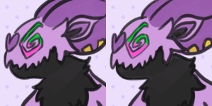
i love drampa so much
Not sure if it should be a Female or Male....
And here's some pixel art

i love drampa so much
Also sorry if what I'm posting is wrong, I'm so afraid I'll mess up pff...
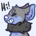
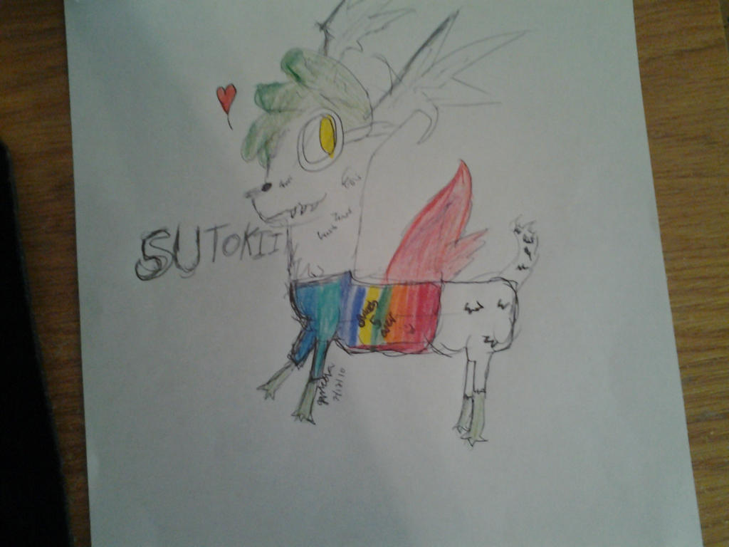
Anyway, can someone critique this drawing of my oc I did, please? <33
Sorry this is kind of late, but I figured better late than never
The design is hella cute, but there's some anatomical stuff that is a kind of off in the drawing. The eyes are kind of big for it's face, and you might want to adjust the size so it fits a bit better. Big eyes aren't bad, but those are pretty darn big. Also it's grin. Since a mouth is in the center of a face, and he's standing at a half face view, not all of his grin would be on that side of the face, and part of his mouth should be, like, on the edge of the face drawing/lineart if you know what I mean (idk how to explain it better). Also the dark little lines (I assume are shading) is in kind of awkward places, since it makes the light source kind of unclear.
Ahh, that was longer than I thought it was gonna be, hope it helps a little bit ;v;
 Don't have an account yet?
